At school we work in 4 phases/ periods for the entire school year. In phase 3 we got the assignment to choose a
antonym. These could for exapmle be Black & White, Tall & Short, Hot & Cold, Pretty & Ugly.
After you'd find a antonym that fits you, you had to make 5 different artistic drawings about you antonym. 3
were already given, namely make an illustration, a photo montage
and a flyer with your antonym. For the other 2 you were free to decide what you'd make.
I choose for the antonym Strong & Weak (Sterk & Zwak).
For my Illustration I thought about making a tree being cut. This would maake the tree weak because it's
about to fall down.
However, since the tree isn't falling down yet and the axe is stuck makes the tree also strong. This way the
tree is both sides of the antonym.
I used Photoshop to make the illustration.
Since I can choose the other two artistic ways to demonstrate my antonym I choose to do it a bit different than
normal.
I wanted to make an abstract version of strong and weak. And I wanted to do that using colours. So I
searched on Google. I stumbled upon paint pouring. I thought that this was an
interesting way to do abstract. I could use two opposite colours such as green & red or purple & yellow.
However,
I choose to do blue & orange. I choose those two because yellow is too much of a mess to work with and
red
& green gave me to much christmas vibes.
So I started searching on Youtube for a beginners pouring. I bought a few canvasses to practise on and the
one
I liked most will be the one I'd choose. After a lot of trying out (I don't have pictures of these) I found
the perfect one to make as my abstract. Because you can totally see that the orange colour is stronger/ more
present then the blue one, which makes that colour more weak.
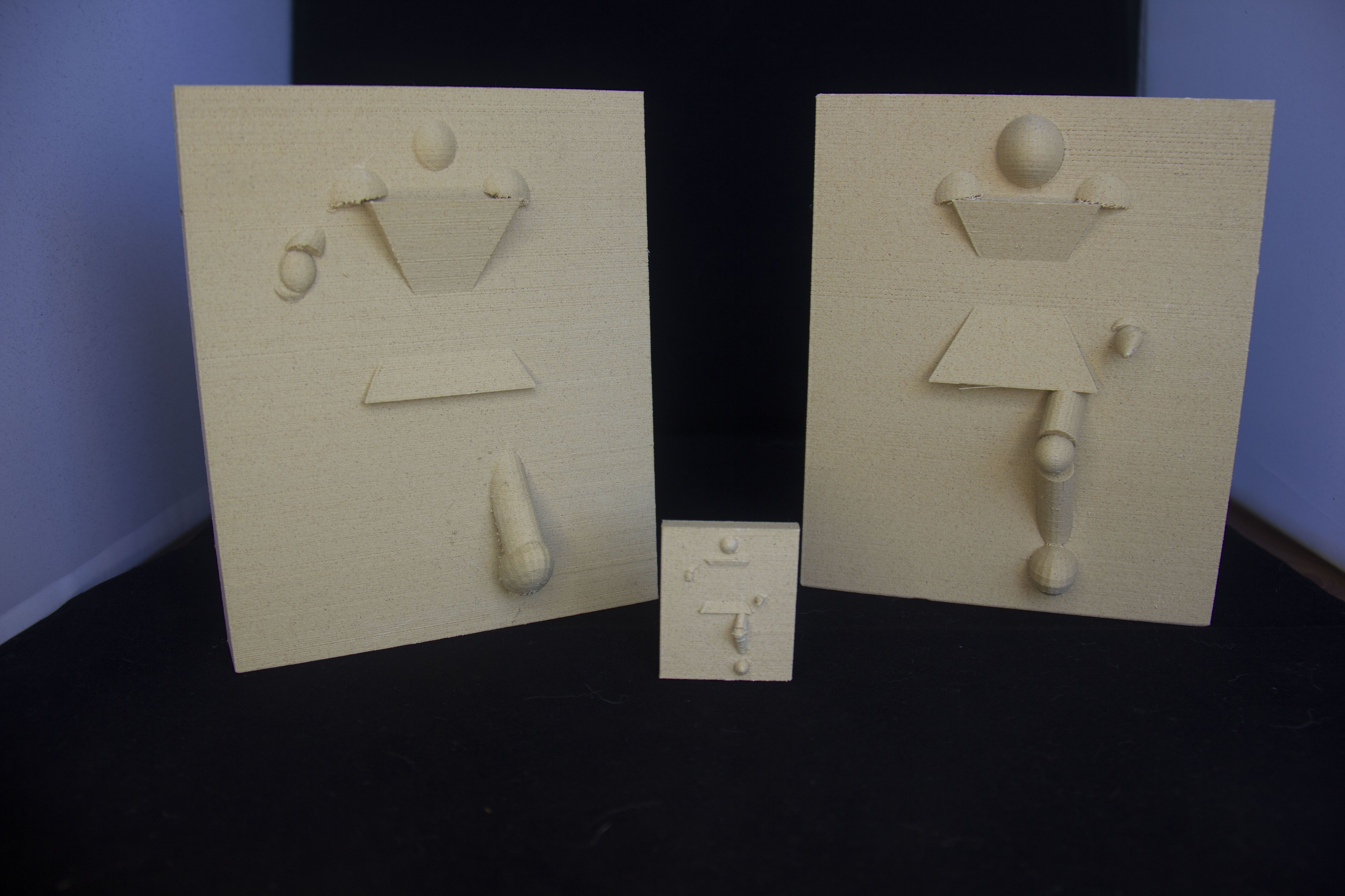
For the next one that I could choose myself I wanted to make a 3D version. I didn't want to do it usingmy hands
but I wanted digitally done and then 3D printed. This was oonly poossible because my dad recently bought a 3D
printer.
I thought about something that was quite interesting to display as both Strong & Weak. This eventually led me to
the photo that I've also used as my topic picture. I thought this was a cool idea. Because the character is
strong enough to go through the wall, but not strong enough to go fully through the wall, which makes him also
weak.
So I initially wanted to do this with Cinema4D. But this software was way to new for me. I know in C4D I could
easily use the already made character but I wanted it to be a bit more abstract then that. And I couldn't figure
out how to use the bone in the character so it wasn't a success. So I tried doing it with another, free,
software. After a bit of searching I found Tinkercad. In there I could easily create my character.
With my photomontage I knew quite quickly I wanted to do something with an egg. Why? Because I recently
discovered on Instagram that dogs know they're fragile and will hold them gently in their mouth.
So I thought that since eggs are fragile to use it as a way to show that it can also be used for something
strong.
After a bit of searching I thought it would be funny to use an egg as something that if done in real life,
would totally crack. So I searched for something that it could actually be also seen as a functional part of
an object. This led me to use an egg as part of an sofa. With the egg used as one of its legs.
I used Photoshop once again to make this photo montage.
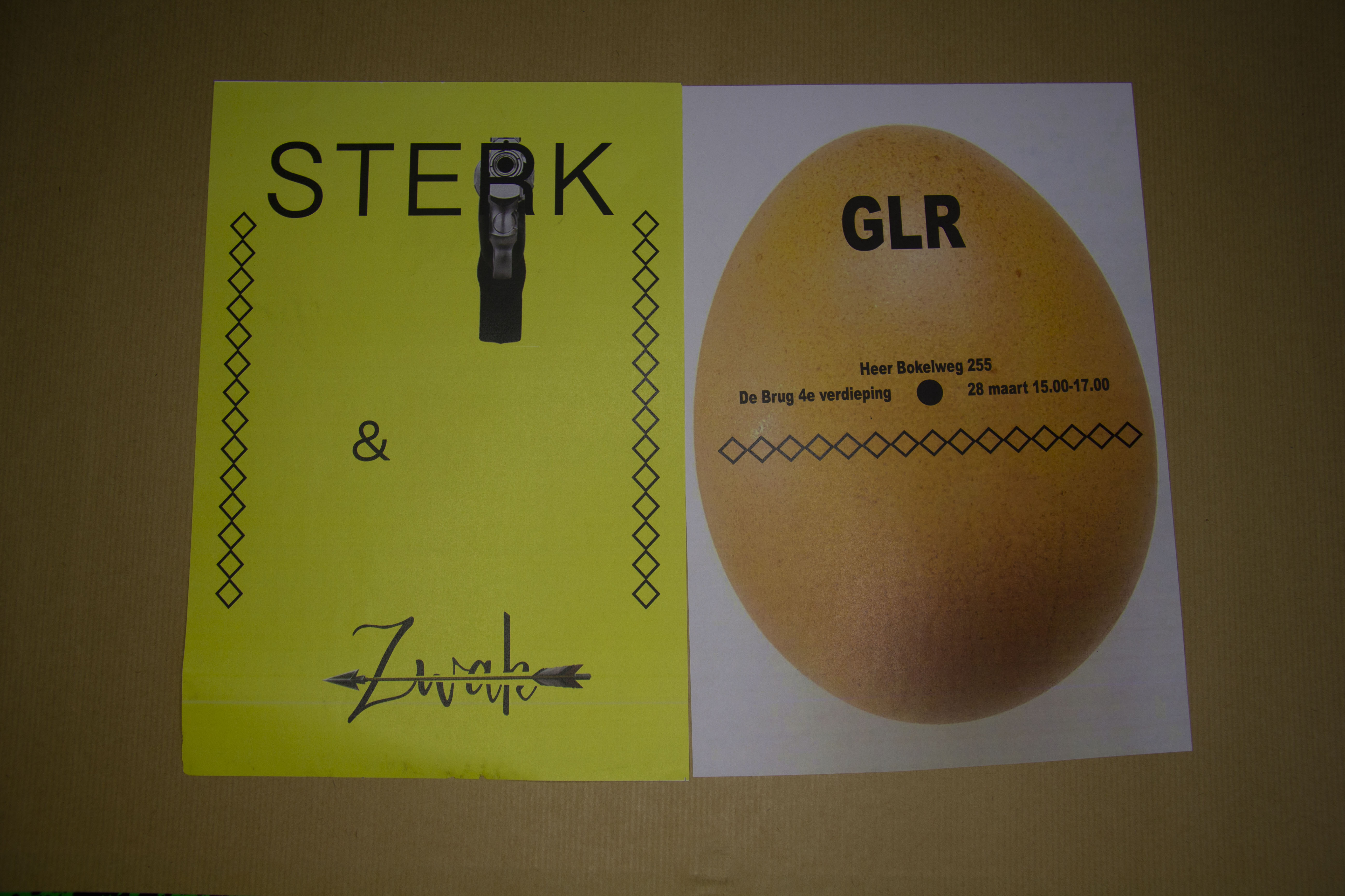
For my final display I needed to make a flyer. I thought it would be a fun idea to use the egg from my
photomontage as a reference to know what's to come.
In my flyer I also wanted to make my fonts have a difference in a weak font and a strong font. For example a
strong font is more all caps instead of a pretty cursive font.
I also thought it was a fun idea to use something extra. As guns are way more strong to kill you instead of
a weak, wooden, arrow.
As seen in the picture, the yellow page is the front page (Sterk & Zwak) and the egg page is the backside.
On the backside
I've put the date and the location for people that wanted to join.
I used InDesign to make the flyer.
After I've made all these displays to show my antonym Weak & Strong, we were told that we'd present this during
an exposition.
In "End Result" you'll also go to my Instagram and see how I've made my exposition for a grade.
In "Story Highlights" you'll go to my work Instagram and specifically go to a story highlight about this
Exposition.